
Cision’s Press Release Workflow
Redesign of an internal enterprise workflow
Summary
From 0 to 1, alongside my product collaborators - I drove the vision and redesign. Making this enterprise workflow more efficient and usable.
Timeline, 6 months
Team
Lead designer (me)
1 Product Manager
1 Delivery Manager
5 Backend engineers
2 frontend engineers
Skills
User testing/research
Prototyping
Visual Design/UI
User Experience
Cross-functional Workshops
BACKGROUND
Cision press release distribution platform, is in need of revamping how their internal team processes releases.
Experience Strategy: Offer a workflow that empowers the internal processing team to effectively and efficiently distribute press releases.
Business Strategy:
Improve processing time by 70%
Reduce onboarding time from 3 months to 1 month
Automate significant parts of the workflow

Built in 2007, the product team has used the same software for over 15 years. Adding workflows, buttons, and tables to serve the teams evolving needs, this Frankensteined product has now become a burden to use.
PROBLEM 1
Press release queue lacks clarity, requiring specialists to spend time investigating before choosing a release.
Customer service specialists wasted time determining which press releases to work on first, manually checking deadlines and customer contract details.
SOLUTIONS
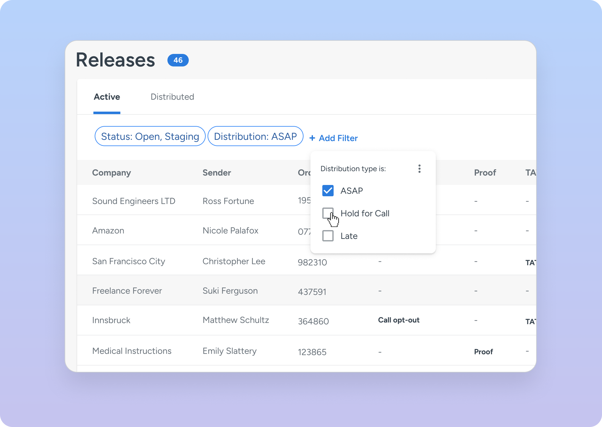
Central queue that automatically sorts releases by urgency
Performed a series of card sorting exercises to identify relevant columns and hierarchy
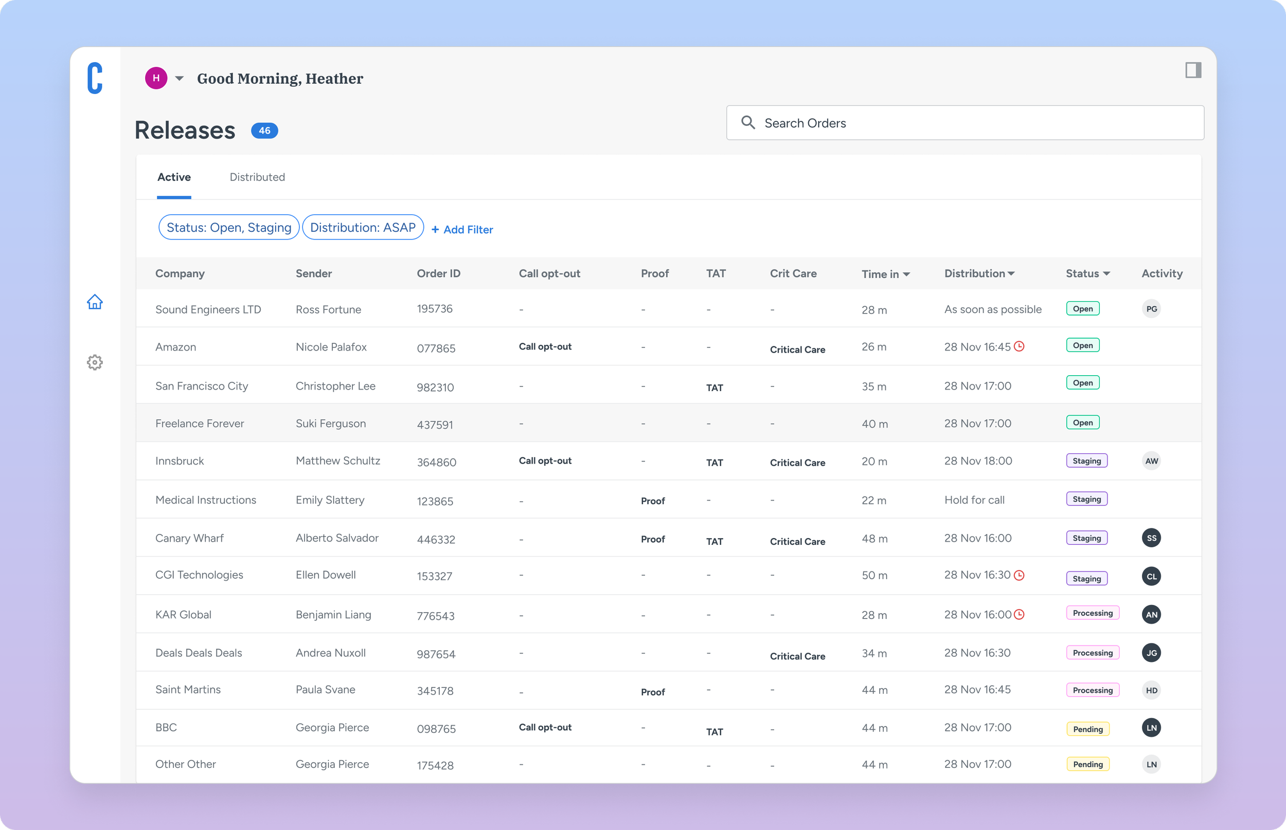
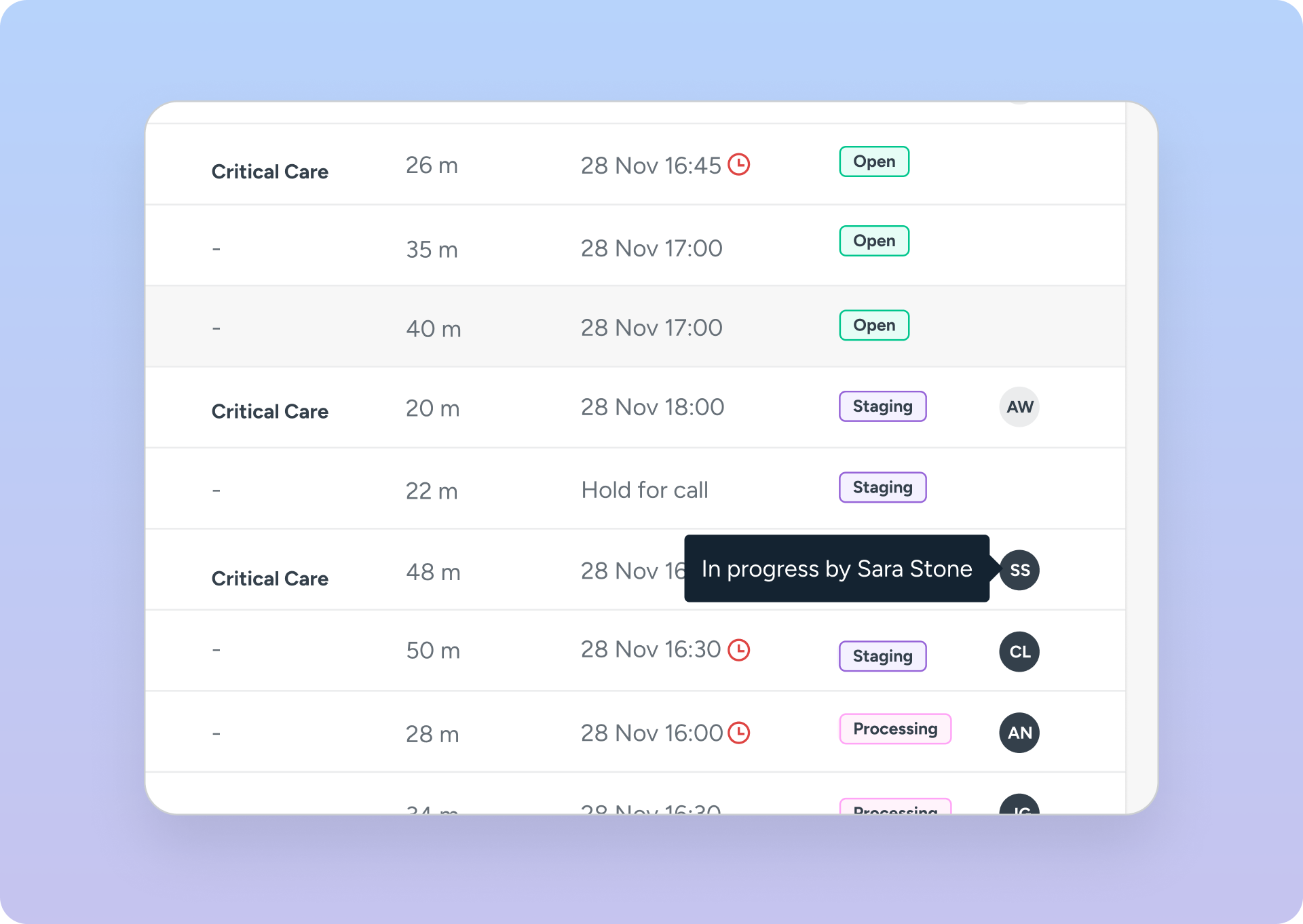
Activity Status
Activity information helps to inform managers of the workload, and opens up order transparency
Filtering and sorting information
Specialist can filter down to the customer base they are working on that day
PROBLEM 2
Processing a press release can take between 15 minutes to an hour, often with user errors.
Specialists relied on memorized steps or separate documents as checklists, and wrote manual notes about incomplete items.
SOLUTIONS
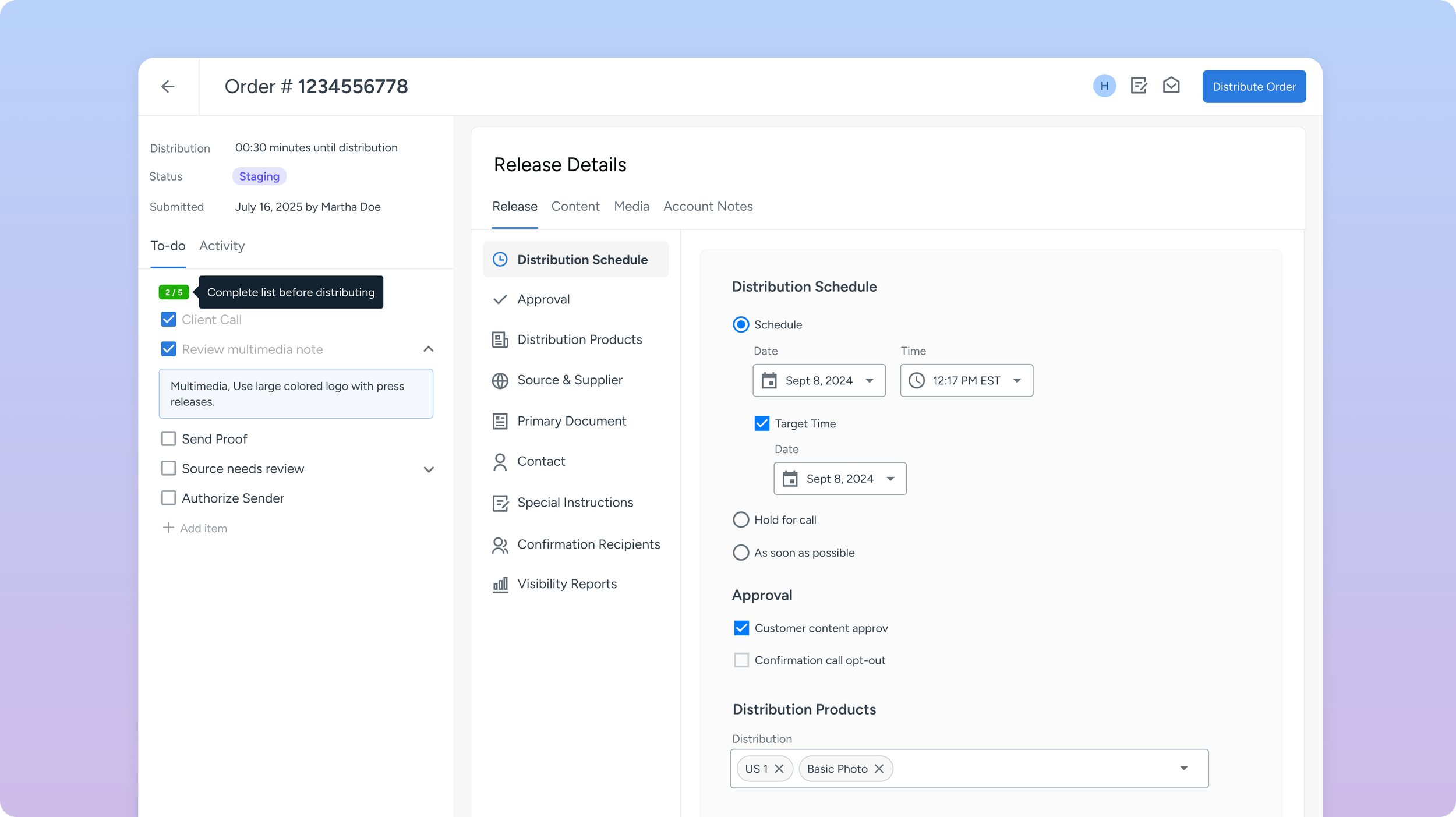
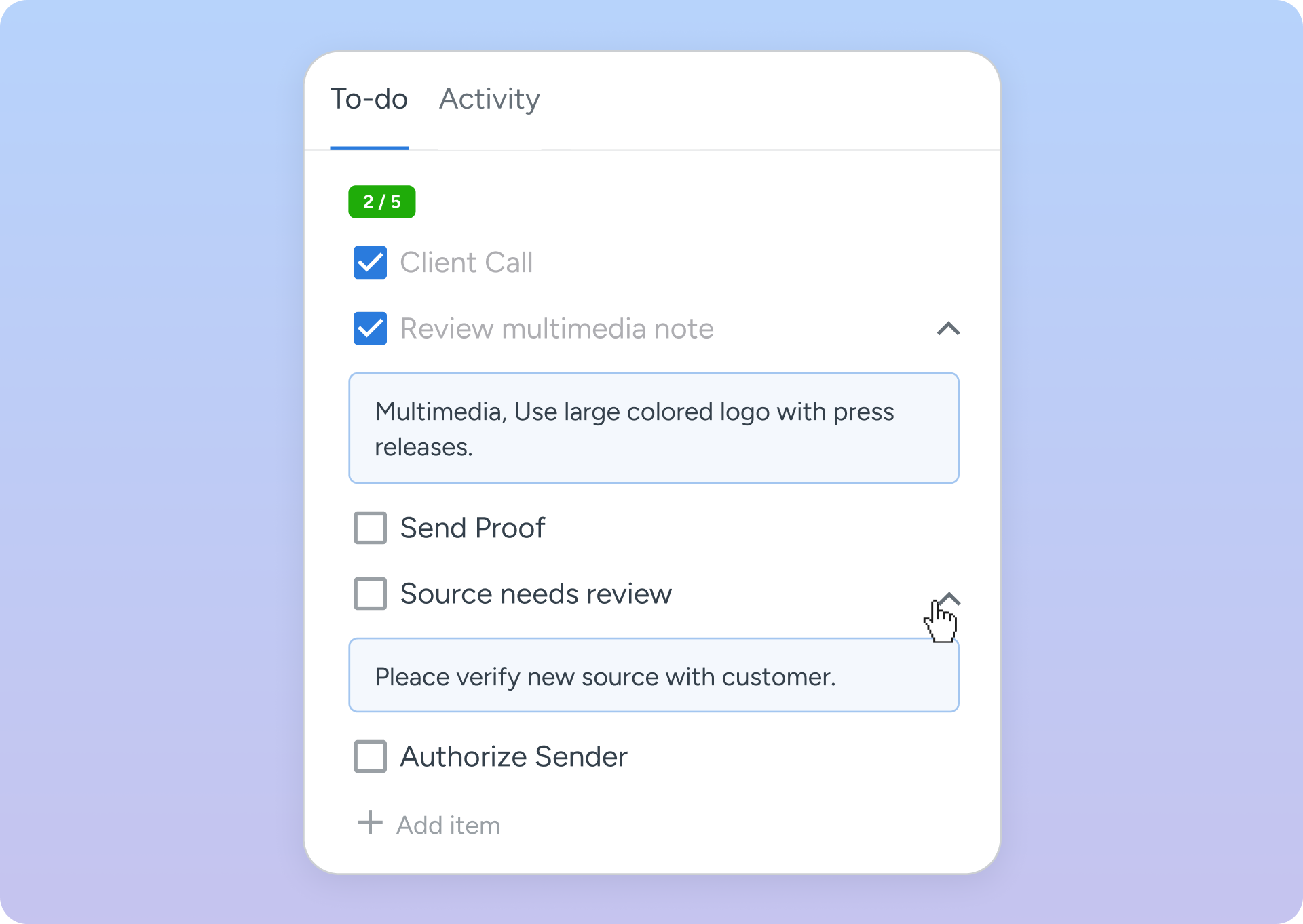
A Central Workspace
Restructured the IA based on how specialists work in real-time
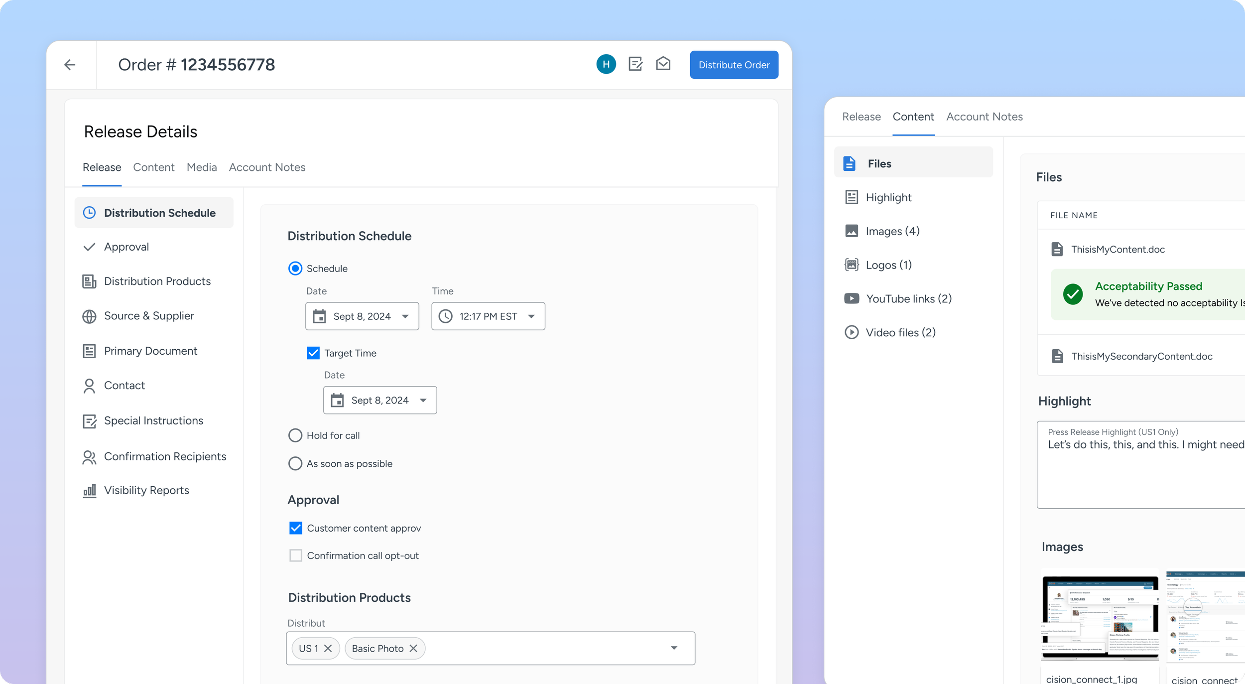
Order Specific To-Do List
Eliminate cognitive load by listing order to-do’s Borrowing from a training document to-do list, we implemented a tasks tailored for each order
Account Notes Flagged for Review
We automatically review account notes that will impact their workflow
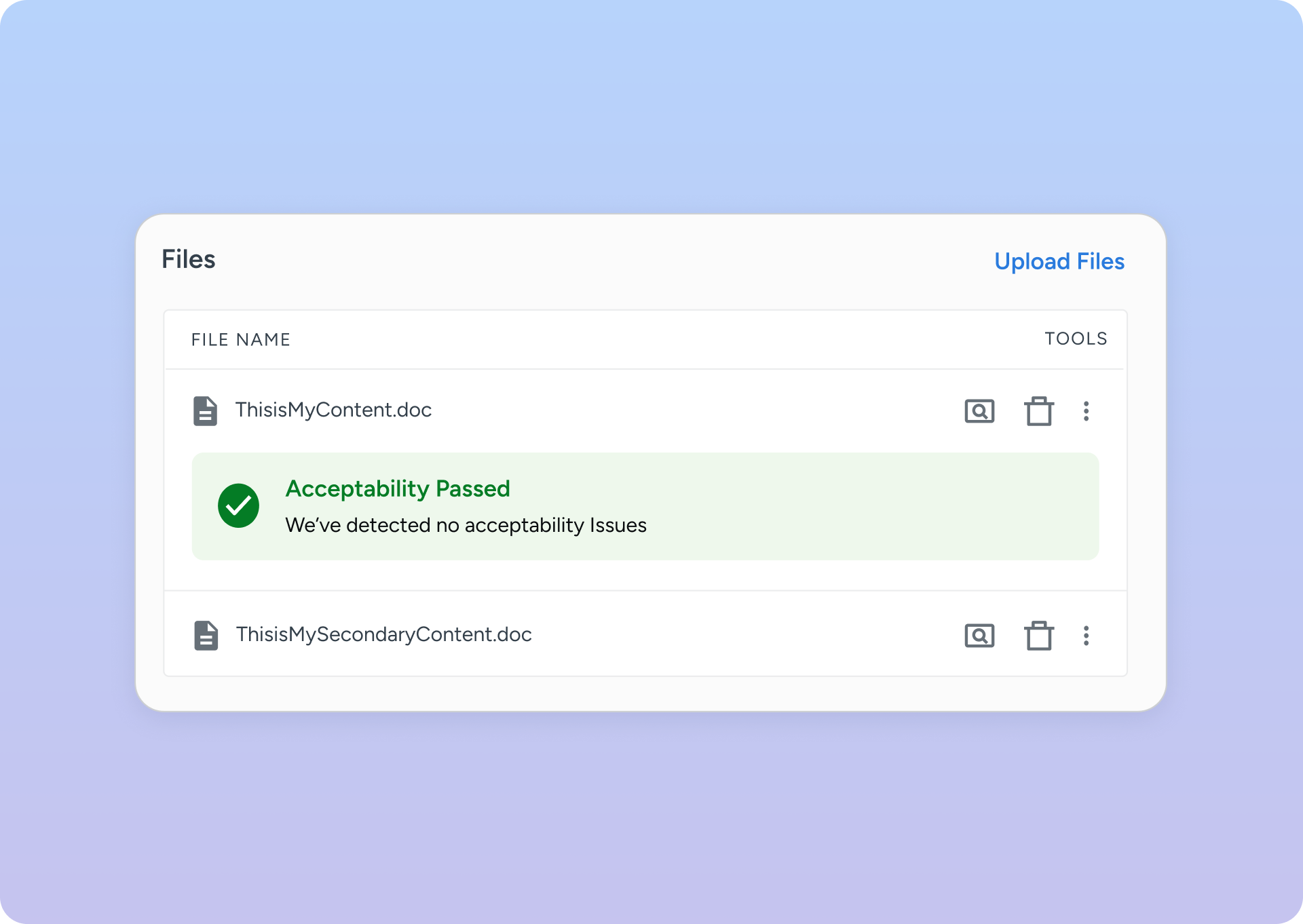
Document Acceptability Scans
No more manual reviews of each document for acceptability issues, specialist know upfront
Challenges
Legacy Platform Distinguishing between genuine user needs vs workarounds evolved from years of technical debt.
Scope Creep Feature requests by stakeholders continuously pushed our launch date
Stakeholder buy-in Stakeholders had a hard time trusting that the MVP would be sufficient
Outcome
A functioning MVP was built in 6 months, but due to stakeholder pushback, we paused on onboarding users until more